SIM - Script Form

Module: SIM Script Forms
Path: Campaigns > Advertising > Script Forms
Topic: Script Form
Version(s): 5.1
Editions: Commerce and Call Center
What Are SIM Forms?
SIM Forms are guides for agents to follow during order entry.
Making The Connection
Where Will I See This Within OLX?
During order entry, when SIM settings are enabled on the agents employee setup, SIM forms will populate to guide the agent through the order process.
What Reports Can Be Pulled?
- at this time there are no reports related to SIM
What Imports/Exports Relate to SIM Form
- at this time there are no imports/exports related to SIM
Trouble Shooting
Agent gets classic entry instead of SIM entry form
-
Edit the employee record and check the box for SIM Enabled
-
I don't see the correct forms when I am placing an order
-
verify the DNIS being used is attached to the correct script with the forms expected
-
Company Data > Advertising > Source
-
Filter by DNIS
-
Edit the source
-
Adjust the Script
-
Save source
A potentially dangerous Request.Path value was detected from the client
- Review the data on the form
- copying and pasting can potentially break HTML code
- to determine if it is "bad" HTML:
- make a copy of the script.
- start at the last form and delete one form
- click the Apply button
- and then the Preview button
- is the problem still displaying?
- yes
- repeat steps, deleting the current last form
- no
- if the problem is gone then the last form deleted had the bad HTML
- navigate to "real" script
- edit the form that has the "bad" HTML
- you can
- delete the form and start fresh
- or cut and paste the HTML into an online HTML checker
- find and fix the HTML
Script Event/Action Editor
Each attached form can be configured to do a variety of actions, depending on user-initiated events. This pop-up screen allows detailed configuration of how these actions are evaluated and carried out.

Note: Script rules can not apply to script forms.
Navigate to Campaigns > Advertising > Script Form. This is where users will design the form(s) that they wish to add to a given script(s) in the system.
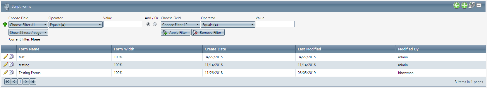
click the add new form button from the header bar to create a brand-new form
- A new script form window will pop up
use the pencil icon next to an existing form that you wish to modify.
- the form will display in a new popup
click the copy icon to make a copy of an existing form
- a copied version of the form will display in a new popup
Create New Form
Form Editor
The Form Editor will automatically display:
- Fill in the Form Name field at the top left of the screen.
- Form names must be unique for all forms.
- It is recommended to name forms in such a way that you know what actions are taking place in the form.
- This helps when edits or trouble shooting is needed.
- Next select a client if the form being created will be client specific.
- If using in a generic setting across all scripts in the system leave set to None.
- Width is how wide the form will display to the agent during order entry
- you can select
- percent
- pixels
- If the width is 100% the form will always take up the entire screen horizontally with no scroll bars regardless of the elements inside the form. If it’s questionable whether the form will fit into the screen based on the contents you should set the width to be pixels and make sure it encompasses all the elements in the form.
- Height is how high the form will display to the agent during order entry
- you can select
- percent
- pixels
- If the height is 100% the form will always take up the entire screen vertically with no scroll bars regardless of the elements inside the form. If it’s questionable whether the form will fit into the screen based on the contents you should set the height to be pixels and make sure it encompasses all the elements in the form.
- All the way to the top right is the
Pin Form To Script button.
- pinned will prevent the form being edited on other scripts where it is used.
- essentially you are making a copy of the form that is specific to this script only
- unpinned will allow the form to be edited on all scripts
- Back to the left menu below Form Name and Client is the Tree View - design space. This is where the visual aspect of the form is designed.
- The parts of the form are outlined here with open and close controls
- Form
Header - top section of form
element
- Note: The Add/Edit Column window for the header and footer differ slightly from regular columns, in that you cannot edit the name and you are setting a height in pixels instead of a width. You can also set a border size in pixels (the border color will always be black) and a background color of the entire header/footer. Once you change the height to a value greater than zero and save you will be able to see the header/footer outlined in a red dotted border at the top or bottom of your form.
- Col# - the divided space in the middle of the form between the Header and Footer
- element - the information displayed within the column
- items - pre-configured buttons added within the element.
- Note: You can delete a column as long as it is not the only column for the form (excluding the header and footer) by opening the Add/Edit Column window and clicking the Delete button, or by right clicking on the column and selecting ‘Delete Column’.
- The column name will be defaulted to a generic name, however you can modify to be more specific.
- Set the width of the column in percent or pixels. If the width is 100% the column will always take up the entire form horizontally, with no scroll bars regardless of the elements inside the column. If it’s questionable whether the elements will fit into the column based on you should set the width to be pixels and make sure it encompasses all the elements in the column.
- Set a border size in pixels (the border color will always be black)
- Set a background color for the entire column.
- Click the save button to save your changes, they will be reflected in the preview pane. Each column is surrounded by a red dotted border in the preview window (unless you have specified a border width, then it will be a solid black border). The red dotted border will not be rendered in the order screen, it’s just to give a visualization of where the columns are
Footer - bottom section of form
- You can add additional columns and elements to the form from this view pane
- Right clicking on branches will allow you to:
- Add Element - This opens the Add/Edit Element screen
- Edit Column - allows you to set the display parameters (same as double clicking the branch, see below)
- Double clicking on a branch will allow you to set the display parameters
- Column Name
- Height in pixels -
- Border Width in pixels
- Background Color
- Delete Column - removes the column from the form
- The middle pane is the workspace. This is where function is configured for the visual elements.
- Far right pane is the Custom Fields
- Custom fields created for this form and then added to an element.
- Global custom fields that can be used across all forms and then added to an element.
- this is not associated to the Custom tab on the Maintain Script > edit script
- this will not show on the custom fields displayed on the order
- this will not save on backend tables
- You can create form specific custom fields, to capture and display additional information. To add a custom field you can click on the Add Custom Field button or right click the ‘Custom Field’ node and select ‘Add’. To edit a custom field you can double click the custom field node or right click the custom field node and select ‘Edit’.
- Enter a name for the custom field and select the Field Type. There are different options based on the type of custom field type you want to create.
- If you decide to want to use this custom field in other forms, check the "Global box" and the field will appear in other forms.
- When selecting Alpha/Date/Numeric types you have the option to enter minimum and maximum values, along with a regular expression evaluation. (Note: This is an advanced feature, if you do not have experience with regular expressions, it’s best to leave it blank).
- When selecting a Boolean field, you have the option of rendering it as a checkbox, or a radio button. If rendering as a checkbox you can enter a label that will appear before the checkbox. If rendering as a radio button, you can enter the labels for the true and false values.
- When selecting a button field, you can enter a label which will appear as the text on the button itself.
- When selecting a list Field Type, you can also select the way you want the field rendered including a checkbox list; drop down list and radio button list. You also need to enter the values that will appear in the list and the display order.
- Click the save button once you have entered values into all required fields; and the custom field will appear in the custom field tree. The field will now be available to add to an element. Note: If you save a custom field as a global field, it will not appear in the tree; but will be available to add to an element.
- You can delete a custom field by opening the Add/Edit Custom Field window and clicking the Delete button, or by right clicking on the custom field and selecting ‘Delete’.
- The last row contains configurable event buttons. A single click on any of the buttons will open the configurator and allow you to set the desired actions.
- Init (Initialize) - the first event that occurs when the form is displayed.
- Timer - background feature behaves as an alarm for each form to raise an event that can be customized with action(s)
- Home form
- Previous form
- Next form
- End form
- You can preview the created form by clicking on the Preview button all the way to the bottom right
Add Element
- Element Name - This is a required field
- Name will be defaulted to a generic name, however you can modify to be more specific.
- Elements display on the form alphabetically.
- Column - This is the divided space in the middle of the form between the Header and Footer.
- By clicking on the drop down you can move the element to a new section.
- Product Offer - is not used and will be removed from screen soon
- Width - How much space within the column will the Element utilize.
- Percent
- Pixels
- Choose an Element Template
- If you have created global elements (more information below) you can select them in this screen. Once you choose the global element from the drop-down list, you can click the insert element template button, and all of the information from the global element will be (copied) populated in the body of this element. You can make any changes desired, without modifying the existing global element. Any changes will only be specific to the element you are adding/editing.
- Insert Template - displays a copy of the element selected from the element template drop-down
- Border Width - thickness of border in pixels
- Background - select the color for the background of the element
- Pos-X - is not used and will be removed from screen soon
- Pos-Y - this is the order the element will show relative to other elements in the same column.
- Type - is not used and will be removed from screen soon
- Properties - this box will display available properties for the button/field selected that are able to be configured from the Element popup. Event driven interactive settings are configured outside the Element popup. See Interactive Settings below.
- The view of this box will adjust based on the button/field selected
- Products - you can search for product offers to create a button with the offer name as the label on the element and quantity set.
- search bar will display any product setup in system - is not filtered based off products added to script
- you will need to add offer to script if you select an offer not already assigned to script
- This sets action to Set Offer Attributes - any other actions will need to be set manually
- Product Offer - set when adding button to element
- Rush = Do Nothing
- Quantity - adjustable when adding button to element
- Selected Only? - unchecked
- Actions
- Action Button - adds a button with no preset configurations.
- Label
- this displays to the agents
- example:
- Type
- Button
- Checkbox
- Radiobutton (group 1-15)
- groups relate buttons together (only one item can be selected)
- Action
- User Defined
- You will have to assign/set interactive settings for the button.
- Go Home (form)
- Previous (form)
- Next (form)
- Go End (form)
- Collapsible Content - This inserts a two-section text field with a Title and Body. Title will display on screen for agents and will expand when clicked on. Will collapse when Title is clicked on a second time.
- Go Previous Button - adds a preconfigured button to navigate to the previous form.
- Go Home Button - adds a preconfigured button to navigate to the home form.
- Go to End Button - adds a preconfigured button to navigate to the end form.
- Go Next Button - adds a preconfigured button to navigate to the next form.
- Linked Field
- Does not save in database.
- You will have to assign/set interactive settings using an action button (navigation or preconfigured action button from element setup).
- Call/Order Fields - these are hardcoded buttons and fields found on classic order entry.
- You cannot edit these buttons.
- If you want to create custom fields to be used across many different forms, you can create global custom fields. These differ from form specific custom fields, in that they can be attached to any form. Navigate to Campaign > SIM Custom Fields
- OLX fields that can be added to an element which displays static information.
- OLX fields that can be added to an element to capture/view order information.
Label - Pre-Configured display only labelInput - text box that sets information to be displayed when Label is usedPre-Configured ButtonAction of Pre-Configured ButtonAgentFirstBillAndShipSameCheckCopyBillToShipButton
AgentLast ProcessButton
CallStartDate
ProductsTable
CallStartTime
SubmitButton
Campaign
ScheduleCallbackbutton
DNISWrapUpBlock
EmployeeName
EmployeeNumber
OrderTotal
ShipTotal
SubTotal
TaxTotal
WebOrderNumber
AccountNumberAccountNumber
AgeAge
BankCityBankCity
BankNameBankName
BankStateBankState
BillAddress1BillAddress1
BillAddress2BillAddress2
BillAddressBlockBillAddressBlock
BillCityBillCity
BillCountryBillCountry
BillFirstNameBillFirstName
BillLastNameBillLastName
BillMiddleInitialBillMiddleInitial
BillPhoneNumberBillPhoneNumber
BillPMPhoneNumberBillPMPhoneNumber
BillStateBillState
BillZipCodeBillZipCode
BirthDateBirthDate
CallDispostionCallDispostion
CallTypeCallType
CCExpDateCCExpDate
CCNumCCNum
CheckNumberCheckNumber
CompanyNameCompanyName
CustDemoNotesBlockCustDemoNotesBlock
Custom1-5 fieldsCustom1-5 fields
CVV2CVV2
DebitDebit
EmailAddressEmailAddress
ExternalOrderNumberExternalOrderNumber
GenderGender
LocationLocation
NoSolicitNoSolicit
NotesNotes
PackingSlipCommentsPackingSlipComments
PayMethodPayMethod
PayReferenceNoPayReferenceNo
PhoneExtensionPhoneExtension
PromoCodePromoCode
RoutingNumberRoutingNumber
SavingsSavings
ShipAddressShipAddress
ShipAddress2ShipAddress2
ShipAddressBlockShipAddressBlock
ShipCityShipCity
ShipCompanyNameShipCompanyName
ShipCountryShipCountry
ShipFirstNameShipFirstName
ShipLastNameShipLastName
ShipMethodBlockShipMethodBlock
ShipMiddleInititalShipMiddleInitital
ShipPhoneNumberShipPhoneNumber
ShipPMPhoneNumberShipPhoneNumber
VoicePrintIDVoicePrintID
WarehouseCommentsWarehouseComments
- Work Space - This is the section the agents will see during order entry.
- Format Tools - Enter the body of the Element. You can alter the way the body looks by using the various tools located on the format toolbar.
- View
- Design - this is WYSIWYG screen editor
- HTML - you can use HTML to design the form.
- Preview - you can preview the form to see how it will display to agents during a live call.
- Wrap Up Buttons
- To save the changes click the Save button
. This will close the Form popup and take you back to the Script Form tab.
- To apply the current changes you have made click the Apply button
. This will not close the Form popup but will save edits made.
- To cancel any of the current changes you have made click the Cancel button
.
- This will close the window without saving any changes.
- To print the current window click the Print button
.
- To delete the selection, click the Delete button
.
- This will prompt you to make sure you want to delete this item.
- Clicking OK will delete the element and close the window.
Field Validation Options
Clicking on an "input" field will display Field Validation Options.

Selected validations must be saved on the form and the script must be saved before Preview will trigger validations selected.
- Required
- unchecked - any value to include null (empty) will be accepted to move away from form during order entry
- checked - null value in field will trigger error during order entry and agent will not be able to move away from the form (back, home, end, and next button will be disabled)
- trying to navigate away from form will display an error popup
- Hovering over the field highlighted in yellow will display what validation the system is expecting to be resolved
- Validate Length
- unchecked - any value to include null (empty) will be accepted to move away from form during order entry
- checked
- Min - the least number of characters that are expected in this field
- Max - the largest number of characters that are expected in this field
- trying to navigate away from form will display an error popup
- Hovering over the field highlighted in yellow will display what validation the system is expecting to be resolved
- Number Range
- unchecked - any value to include null (empty) will be accepted to move away from form during order entry
- checked
- Min - the lowest numerical value that is expected in this field
- Max - the largest numerical value that is expected in this field
- trying to navigate away from form will display an error popup
- Hovering over the field highlighted in yellow will display what validation the system is expecting to be resolved
- Regex Pattern
- unchecked - any value to include null (empty) will be accepted to move away from form during order entry
- checked
- Regex Pattern
- Regex Help Text
- trying to navigate away from form will display an error popup
- Hovering over the field highlighted in yellow will display what validation the system is expecting to be resolved

You can find many free tools online to help with regex pattern matching
* To save the changes click the Save button .
* To cancel any of the current changes you have made click the Cancel button .
Interactive Settings
Once you save the element from above, you will find yourself back on the Form view.
Clicking on a user defined button created in the element will display the interactive settings:
Click on Add New Action to configure the action button.
- Set the Action Name - it is recommended to state the action being taken
- IF this step is conditional, click Add Condition button
- set if this will be joined with AND or OR
- select condition
- Condition Group
- Product Offer Selection
- Product Offer Max Quantity
- Product Offer Min Quantity
- Minimum Customer Age
- Order Total Exceeds
- Order Total Under
- Payment Method Selection
- Ship Profile Selection
- Item Type Selection
- Billing Address Match
- Shipping Address Match
- Gender
- Notes
- Credit Card Number
- Email Address
- Phone Number
- Unconditional
- Credit Card BIN Range
- Credit Card BIN File
- Expired Timer
- Product Ordered Before
- Bill/Ship Address Match
- DNIS Match
- Event Argument Matches
- Field Matches
- Required Fee
- Set the Action
- Stop on this action
- Checked
- Unchecked
- Delete Action button
- Action Drop Down
- Select Offers
- Clear Offers
- Show Offers
- Hide Offers
- Go To Form
- Submit Call/Order
- Set Disposition
- Show Message
- Set Custom Value
- Go to Previous Form
- Go To Default Home Form
- Go To Default End Form
- Set Timeout
- Open URL
- Go To Next Form
- Set Offer Attributes
- Set Payment Processing Account
- Run Server Code
- Go To Subscript Home Form
- Replace Offer (if selected)
- Set Element Visibility
- Click Close to save changes and exit popup
* To save the changes click the Save button .
* To apply the current changes you have made, click the Apply button .
* To cancel any of the current changes you have made, click the Cancel button .
This will close the window without saving any changes.
* To print the current window, click the Print button .
* To delete the selection, click the Delete button .
This will prompt you to make sure you want to delete this item.
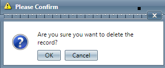
-
Clicking OK will delete the selected item and close the window.
Copyright 2024
Revised 4.22.2025
Related Articles
SIM Elements
Module: SIM Elements Path: Campaigns > Advertising > SIM Elements Topic: Global Elements Version(s): Version 5.1 and up Editions: All Editions What Are SIM Elements If you want to create elements to be used across many different forms, you can create ...Manage Script: Forms
Module : Maintain Scripts Path: Company Data > Advertising > Maintain Scripts > Forms tab Topic : Script Interaction Editor Version(s) : Version 5.1 and up Editions : All Editions What Are Scripts Scripts are the rules setup for order entry, whether ...SIM Custom Fields
Module: SIM Elements Path: Company Data > Advertising > SIM Custom Fields Topic: Global Custom Fields Version(s): Version 5.1 and up Editions: All Editions What Are SIM Custom Fields If you want to create custom fields to be used across many ...5.1.373 - Add Print Support to SIM Preview Mode
Version: 5.1 Patch: Title: Application Category: Patch Type: Description: Added a feature that allows printing of a set of SIM forms. To use this feature, view the SIM form in preview mode by hitting the Preview button on the SIM form management ...5.1.291 - Ignore Script Tax Config
Version: 5.1 Patch: 291 Title: Ignore Script Tax Config Application Category: Other, Order Entry Patch Type: Feature Description: Ignore script tax config option for Order Entry & Sim Added tax provider option to ignore OLX script settings related to ...